Mobile app
Designing for adherence in home rehabilitation
An anonymized interview exercise exploring how guided exercise sessions can reduce cognitive load, lower drop-off risk, and better support patients recovering at home.
Behavior- first UX
designed around pain, stress, and fatigue
2 session models
guided support + controlled flexibility
Adherence- focused
completion over performance metrics
Overview
This project was created as part of an interview exercise for a Scandinavian rehabilitation company. The task was to redesign the active workout experience in a home exercise app and explore how the session flow could better support users during recovery.
I framed the challenge as a behavioral product problem, not just a UI cleanup. Through desk research on rehabilitation, fitness apps, and adherence in home recovery, I focused on one question: how can the interface help users complete the session instead of dropping out?
The result was a concept built around lower cognitive load, guided interaction, and adherence-first design.
Problem
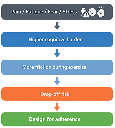
Patients in home rehabilitation often exercise while in pain, under stress, fatigued, or afraid of movement. In that state, too much interaction, too many decisions, or performance-driven patterns can increase friction and lead to drop-off. The problem was not only visual clutter. It was that the workout experience could ask too much from the user at the wrong moment.
If users do not complete the session, the product loses therapeutic value and the data becomes less useful.
Solution
I designed the session around completion rather than performance tracking. Instead of one generic flow, I explored two directions: a fully guided experience for vulnerable users and a controlled-flexibility model for users who needed limited adjustments without breaking the therapist’s plan.
Both concepts were based on the same principle: in rehabilitation, the product should reduce pressure, lower cognitive load, and behave like a calm therapy assistant rather than a fitness coach.
Project goals
Design an active workout experience that reduces cognitive load, supports adherence, and keeps therapeutic intent intact during home rehabilitation.
Goal 1
Reduce decision- making during exercise
Goal 2
Increase session completion and lower drop-off risk
Goal 3
Balance guidance, safety, and limited user control
Role
UX/UI Designer: desk research, product framing, flow design, low-fidelity wireframes, interaction concepts
Tools
Figma, desk research, comparative analysis
Desk research. Understanding the end user
I reviewed rehabilitation apps, fitness products, and public health materials to understand what drives adherence in home recovery and what increases drop-off risk during exercise.
Key findings • Pain, fatigue, and fear of movement increase cognitive burden during active sessions • Too much interaction during exercise can interrupt completion • Fitness apps are often simple to follow, but their motivational patterns do not translate well to therapeutic use • In rehabilitation, guidance and predictability matter more than performance framing
Design implications
The research reframed the problem from workout tracking to adherence support. Instead of asking users to report more during or immediately after physical effort, I focused on reducing interaction at the point of highest cognitive and physical demand.
Useful signals should be captured passively where possible, while user input should be limited to information that is clinically meaningful but cannot be inferred reliably, such as pain or perceived difficulty.
That shift informed the concept directly: guided progression, minimal UI, repetition-based feedback, end-of-session reflection, and bounded flexibility that preserved therapeutic intent without increasing user burden.
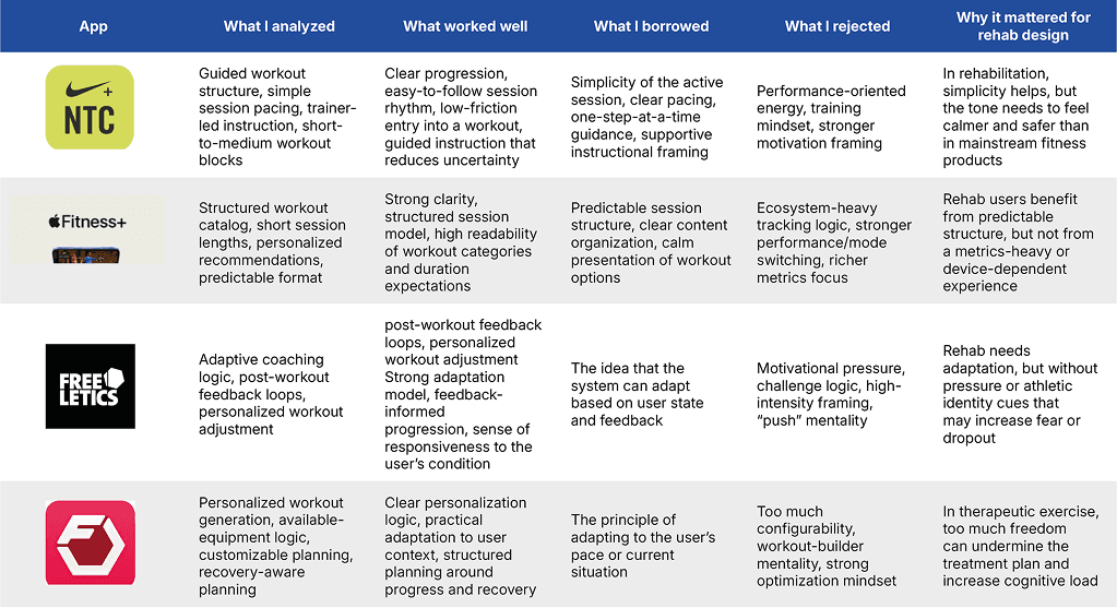
I used top fitness apps as references for interaction simplicity, pacing, and clear session structure, but I deliberately rejected gamification, performance pressure, and unrestricted customization. In rehabilitation, the goal is not to optimize performance but to support completion, reduce cognitive load, and preserve therapeutic intent.
Behavior analysis
I treated the workout flow as a behavioral problem, not just an interface problem. In rehabilitation, users may be in pain, tired, stressed, or unsure of their movement, which makes extra interaction more costly during exercise.
The key risk was that the product could ask too much at the wrong moment. Instead of designing for more tracking or control, I focused on reducing decision load and supporting completion.
Key behavioral insights • Pain and fatigue increase friction during active use • Fear of movement can lower confidence and increase drop-off • Perceived finishability supports adherence • Less interaction can lead to better completion and more reliable data
Concept exploration
I explored two session models to test how different levels of control might affect adherence in home rehabilitation.
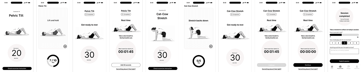
Flow 1 – Guided experience reduced decision-making during exercise through automatic progression, minimal UI, and calm pacing.
Flow 2 – Controlled flexibility allowed limited session adjustments without permanently changing the therapist’s plan.
The goal was not to compare two visual styles, but to explore a product trade-off: more guidance for vulnerable users versus more control for users with higher confidence and lower support needs.
Flow structure
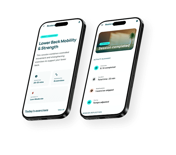
Flow 1 – Guided session flow
This concept was designed for users who need the app to reduce effort rather than increase control. It is best suited for people who may be in pain, fatigued, stressed, unsure of their movement, or less confident using digital products during exercise.
The flow minimizes decisions during active movement and guides the user through the session step by step. Progression is mostly automatic, instructions are delivered one at a time, and the interface stays intentionally quiet during exercise.
The main goal was to reduce cognitive load and make the session feel finishable. Instead of asking the user to manage the workout, the product acts more like a calm therapy assistant that helps them stay in motion and reach the end of the session.
Key characteristics
• step-by-step guided session • minimal UI during active exercise • automatic progression between states • repetition-based progress feedback • pause as the main control point • short end-of-session reflection • low interaction burden throughout the flow
Why this direction This concept responds directly to the core adherence problem. When users are already under physical and mental strain, fewer decisions can increase confidence and reduce drop-off risk.
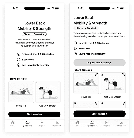
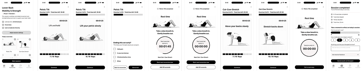
Flow 2 – Structured controlled flow
This concept was designed for users who feel more confident and prefer a greater sense of control during exercise. It supports autonomy, but only within therapist-defined boundaries.
Unlike the guided flow, this version allows selected session-level adjustments such as pace changes, earlier transitions, longer rest, skipping an exercise, or removing it from the current session. More advanced options are placed in secondary controls, keeping the main workout flow readable while still allowing deeper customization.
The key principle was bounded flexibility. Users can adapt the session to how they feel in the moment, but they cannot fully rewrite the therapeutic plan. Clinically defined elements, such as set structure, remain protected.
Compared to the guided flow, this version also supports deeper optional reflection. Users who want to provide more context can complete a richer post-session survey, giving therapists more useful insight without forcing additional reporting on everyone.
Key characteristics
• limited pace and rest adjustments • optional skipping or removing exercises from the current session • session-level customization without permanent plan changes • layered controls through secondary settings • optional manual mode • expanded optional post-session reflection
Why this direction This concept supports users who may disengage when the experience feels too rigid. It increases agency without turning rehabilitation into a fully customizable workout.
Final recommendation
Flow 1 became the stronger recommendation because it addressed the primary product problem more directly: helping users stay in the session when pain, stress, or fatigue make even simple actions feel heavier.
Flow 2 remained valuable as an alternative model for users with higher confidence and lower support needs, but it introduced more decisions and therefore a greater cognitive burden.
Design rationale
The final concept was shaped by one main principle: reduce friction at the moment of highest physical and cognitive demand. Rather than designing for richer tracking or more visible control, I focused on helping users stay in the session. Each design decision was guided by the same question: does this make the workout easier to complete without weakening therapeutic intent?
Key decisions
Repetition-based progress instead of time-based tracking Repetition-based progress feels more concrete and easier to process during exercise. It gives users a clearer sense of completion and makes the session feel more manageable.
Minimal UI during movement During active exercise, the interface should support movement, not compete with it. I reduced visual noise and kept only the elements needed to stay oriented and continue.
Auto-counting instead of manual input Manual logging during exercise adds friction at the wrong moment. Auto-counting helps preserve flow and lowers the effort required to complete the session.
Pause as the main control point I placed optional actions around pause rather than across the active flow. This kept the workout screen calm while still giving users a safe way to slow down, extend rest, or respond to discomfort.
Reflection at the end of the session I moved feedback and reporting to the end to avoid interrupting momentum. This reduced interaction burden during exercise while still allowing clinically useful input afterward. Calm, non-judgmental language
The interface avoids performance-driven or pain-triggering language. The tone was designed to feel supportive and steady, more like a private therapy assistant than a fitness coach.
Business Impact
This concept connected UX decisions directly to adherence, data quality, and clinical value.
By reducing cognitive load during exercise and limiting unnecessary interaction, the experience was designed to help more users complete their sessions instead of dropping out halfway through. In a rehabilitation product, better completion is not only a user benefit. It also increases the likelihood of more consistent therapy, more reliable patient feedback, and stronger signals for physiotherapists monitoring progress.
From a product perspective, this creates a clear value chain: better UX can support better adherence, which improves the quality of engagement and makes the product more useful both clinically and commercially. Better adherence does not only improve the patient experience. It also makes the product more credible as a rehabilitation tool, because stronger completion leads to more reliable data and better support for therapist decision-making.
Learnings
This project reinforced how strongly interface design can influence behavior in rehabilitation contexts.
The most important learning was that adherence should be treated as a primary product outcome, not as a side effect of good UI. If the experience asks too much from users when they are already in pain, fatigued, or unsure, even useful features can become barriers to completion.
It also showed that simplicity is not reduction for its own sake. In this case, simplifying the session meant protecting focus, reducing unnecessary decisions, and placing control only where it was most helpful.
Another key learning was that adjacent product patterns can be useful, but only when filtered through context. Fitness apps offered strong lessons in pacing and clarity, but their performance-driven logic did not fit a therapeutic environment.