E-commerce
Designing a White-Label Comparison Platform
Simplifying admin configuration while keeping product comparison clear for end users
White-label platform
configurable across different clients and product sets
Dual-user system
admin configuration + end-user comparison flow
IA-driven design
structured to reduce complexity and support reuse
Overview
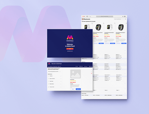
This project focused on designing a white-label comparison platform with two connected layers: an admin tool for configuration and a customer-facing comparison experience.
The challenge was to create a system flexible enough for different clients, product categories, and branding needs while keeping both setup and comparison clear, predictable, and scalable.
My role was to structure the relationship between admin-side inputs and front-end output, simplify complex workflows, and design a more coherent experience for both sides of the product.
Problem
The platform needed to support multiple branding scenarios, product structures, and comparison setups, which increased complexity on the admin side. Admin users needed enough flexibility to configure the tool without code, but that flexibility also made the system harder to structure.
At the same time, the end-user experience still had to feel simple, trustworthy, and easy to scan. The core challenge was balancing configurability for admins with clarity for customers.
Solution
I approached the project as an information architecture and workflow problem rather than just a UI task. I mapped how admin-side configuration shaped the final comparison experience and clarified the relationship between setup, data structure, and front-end output.
This led to a more structured system that made configuration easier to understand, improved consistency across white-label variants, and helped keep the comparison experience clearer for end users.
Project goals
Create a flexible and scalable comparison platform that supports both efficient admin configuration and a clear end-user experience.
Goal 1
Support white-label configuration across clients and product variants
Goal 2
Make admin setup more structured and easier to understand
Goal 3
Keep the end-user comparison flow clear, trustworthy, and easy to scan
Role
UX/UI Designer: research, information architecture, workflow design, wireframing, UI design
Tools
Figma, FigJam, research synthesis, IA mapping
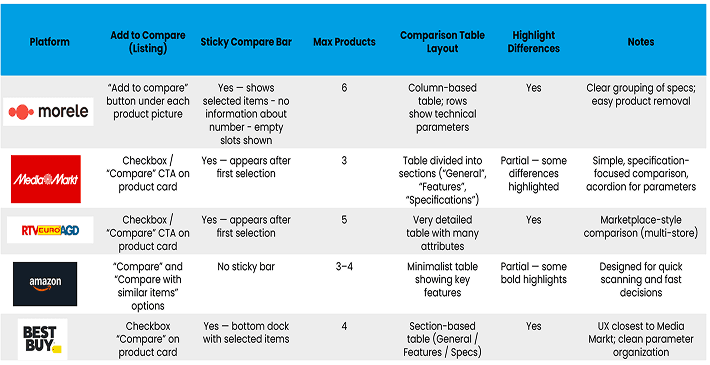
Desk research. Understanding the end user
I began by analysing how users typically compare products, what information they prioritise, and which interface patterns support faster understanding and trust.
This helped define the front-end requirements: clear structure, easy scanning, visible differences, and a comparison flow that supports decision-making without overwhelming the user.
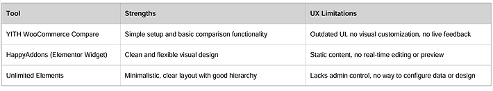
Desk research. Admin Tool.
I also analysed the admin side of the product to understand what needed to be configured, which actions required flexibility, and where complexity was most likely to appear.
The goal was not just to provide more options, but to organise them in a way that made setup easier to understand, more predictable, and less cognitively demanding.
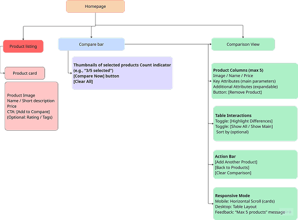
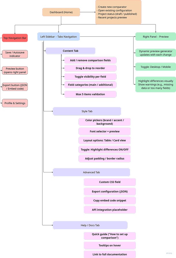
Architecture of Information.
This was the core of the project. I mapped how admin configuration, product data, comparison logic, and front-end presentation connected to each other.
The main challenge was not only designing an interface, but structuring how admin decisions translated into a clear and trustworthy comparison experience for end users.
A stronger information architecture made the system easier to manage, more scalable across clients, and better aligned with both admin workflows and customer needs.
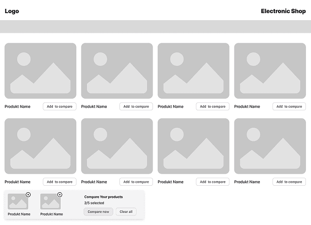
Low-Fidelity Wireframes. End-user flow
The low-fidelity phase focused on structuring the comparison experience before moving into visual refinement. I explored how products should be displayed, how information could be grouped, and how users could quickly understand differences between options.
The aim was to create a comparison flow that felt clear, lightweight, and easy to navigate, especially when users needed to review multiple products efficiently.
Wireframes. Admin Tool
For the admin tool, I focused on simplifying the setup flow and making configuration logic easier to follow. This meant organising actions, grouping related settings, and creating a structure that helped admins understand what they were configuring and how it would affect the final output.
The wireframes helped test the relationship between flexibility and clarity before moving into higher-fidelity design.
High-Fidelity UI — Product Comparison Experience
In the high-fidelity phase, I translated the wireframes into a clearer and more polished comparison experience. The focus was on visual hierarchy, readability, product differentiation, and trust.
The goal was not to make the interface more decorative, but to help users compare products more confidently by making key information easier to scan and interpret.
Admin Tool. Customization Flow
The customization flow was designed to support branded implementations without making the system harder to manage. I explored how admins could configure content and presentation in a way that remained structured, reusable, and adaptable across different client needs.
This helped reinforce the white-label nature of the product while keeping the experience more consistent and scalable.
Usability testing
I conducted quick guerrilla usability tests with 4–5 participants to verify whether non-technical users could understand the main steps of the admin tool: syncing store data, selecting parameters, mapping them to feature groups, and previewing the final comparison card. Each session lasted around 15 minutes and focused on observing natural behaviour rather than collecting formal metrics.
The tests confirmed that the overall flow was intuitive, but users hesitated at “normalized parameters” and field mapping. Based on this, I added clearer helper text, improved labels, and a stronger summary screen with a live preview to increase clarity and reduce cognitive load.
Learnings
1. Admin flexibility needs clear structure Giving users many configuration options only works when the system clearly communicates relationships, hierarchy, and expected outcomes.
2. End-user clarity depends on what happens behind the scenes A simple comparison interface often depends on a well-structured admin system and strong information architecture.
3. White-label products require balance The system had to stay flexible enough for different clients without becoming too complex to manage or too inconsistent to scale.
Next Steps
• Validate the comparison experience with real users across different product contexts
• Refine admin configuration logic based on usability feedback
• Strengthen rules for reusable customization patterns across white-label variants
Business Impact
This concept created a stronger foundation for scaling a white-label comparison product across different clients and product categories.
By clarifying admin workflows and improving the front-end comparison structure, the design supported more predictable customization, reduced ambiguity, and made the product easier to extend over time.
It also showed how better information architecture can improve both internal product logic and the final customer experience at the same time.