Wayfinding
Re-Thinking Public Kiosk UX
Improving clarity, accessibility, and interaction flow without rebuilding the core system
90%+
clients supported implementation after prototype review
UX/UI audit
task-based testing, heuristics, accessibility, ergonomics
Legacy-ready
improved clarity without rebuilding the core system
Overview
This project started as a UX/UI audit of a public wayfinding kiosk used in universities and hospitals. The core flow was already simple and functional, but task-based testing revealed small yet important friction points caused by outdated UI patterns, unclear interaction cues, and accessibility gaps.
My role was to identify where users lost clarity, evaluate the experience through usability, heuristics, accessibility, and ergonomics, and define a redesign direction that improved confidence and readability without requiring major changes to the underlying system.
Problem
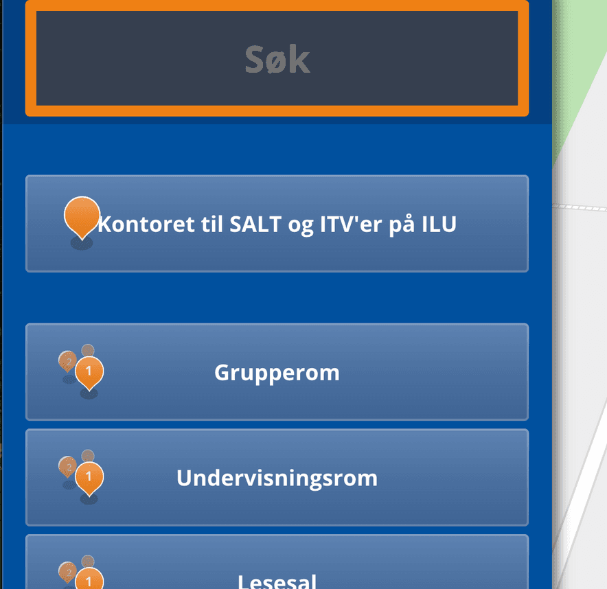
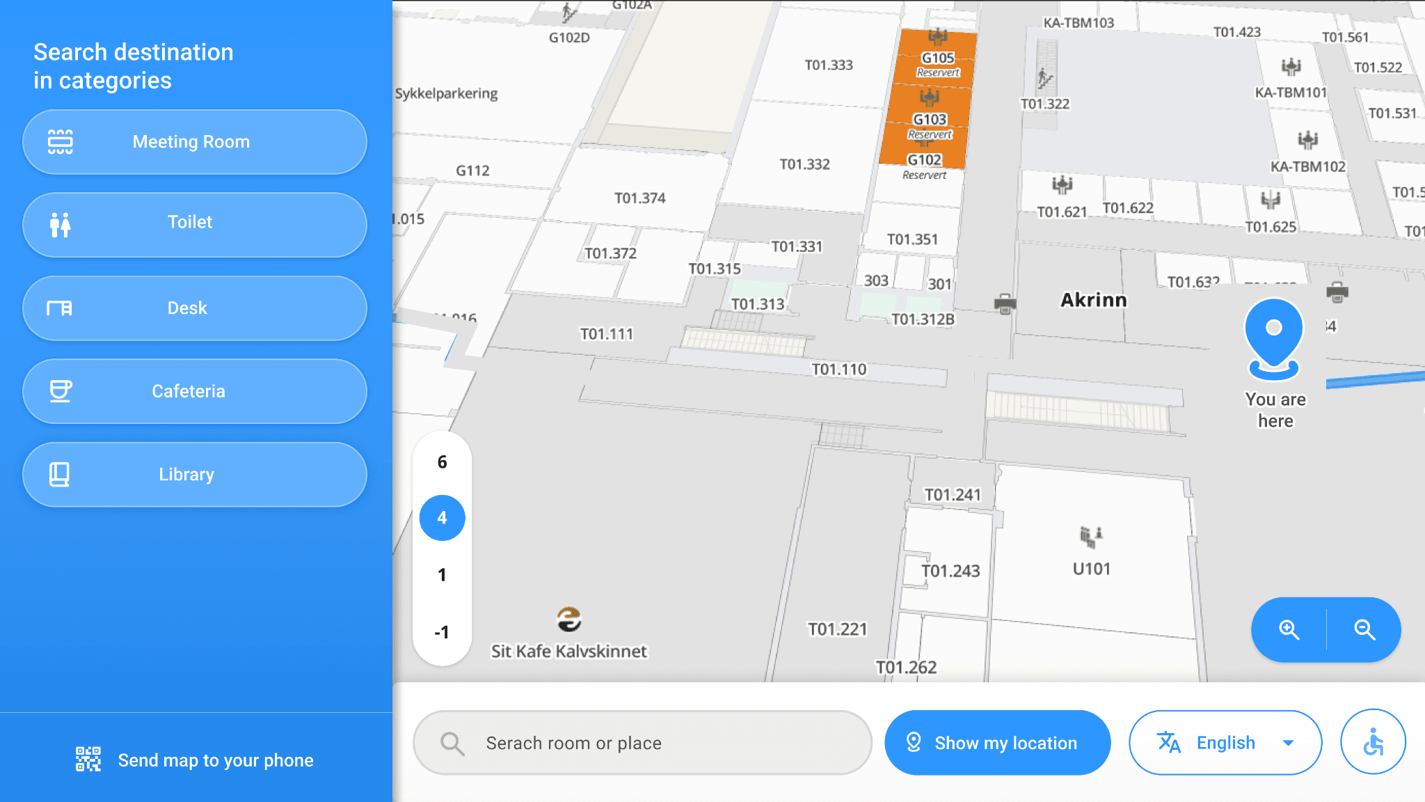
The kiosk was functionally correct, but several small UX and UI issues reduced clarity and user confidence. During task-based testing, some users misread the location search as a button, struggled to interpret grouped secondary actions such as accessibility, language, and categories, and were not always sure what would happen next.
These were not major flow failures, but in a public, high-traffic environment, small moments of hesitation matter. The interface also suffered from outdated visual patterns, weak hierarchy, and contrast issues that affected accessibility and readability.
Solution
Instead of redesigning the experience from scratch, I focused on understanding where users lost clarity and which issues could be improved without disrupting the existing technical engine.
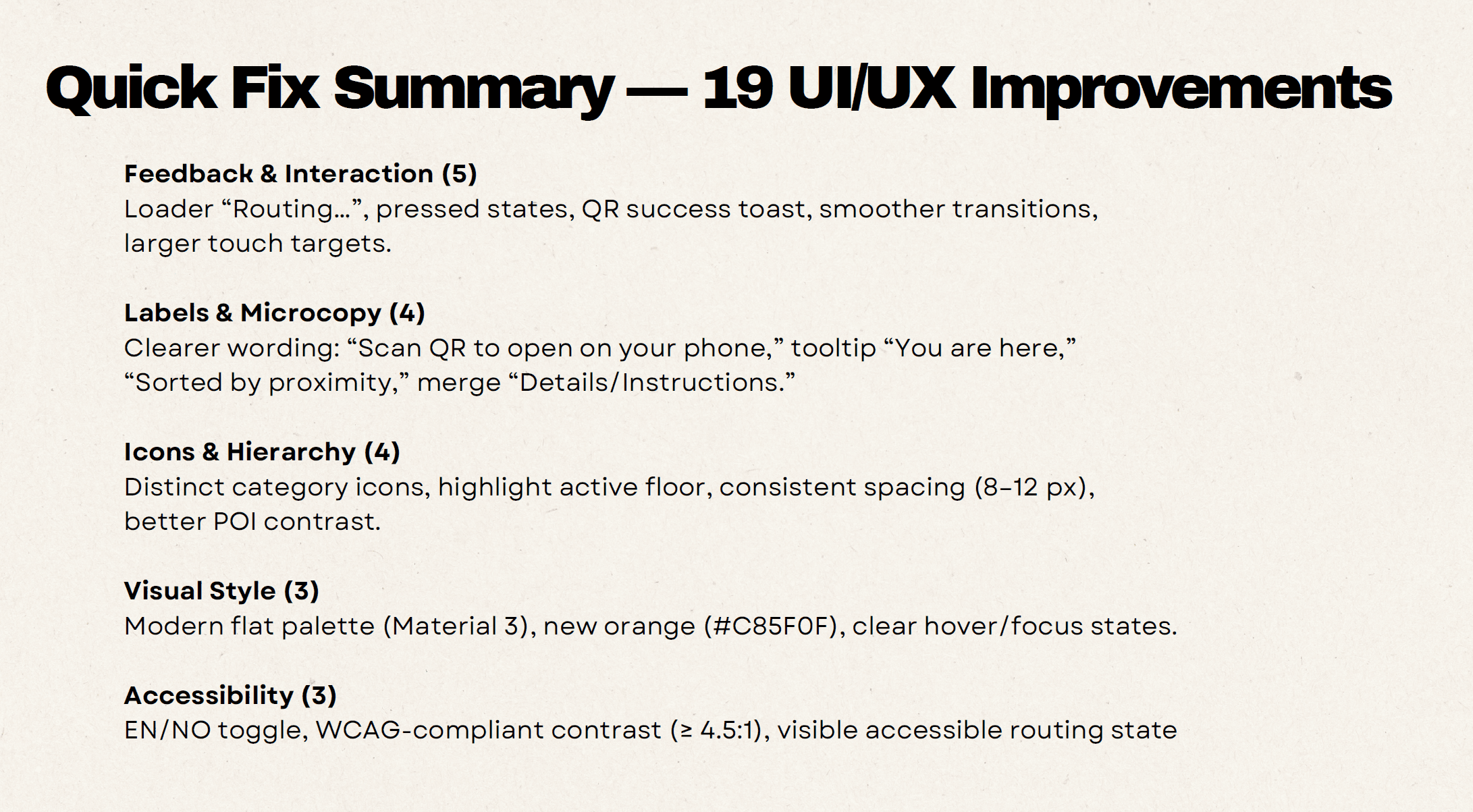
I combined usability findings, heuristic evaluation, accessibility review, and ergonomics to define a targeted redesign direction: modernising outdated UI, clarifying key interaction cues, improving grouping and hierarchy, and strengthening contrast and readability. The final prototype was designed to remain flexible enough for different institutional overlays and gained support from 90%+ of clients after review.
Project goals
Create a modern, clear, and scalable kiosk experience that supports fast wayfinding in high-traffic public spaces.
Goal 1
Clarify interaction cues and reduce visual friction
Goal 2
Improve accessibility, readability, and user confidence
Goal 3
Support flexible branding across kiosk variants
Role
UX/UI Designer (Accessibility-focused)
Tools
Figma, Miro, Jira, Confluence, WCAG evaluation tools
Team
UX designer, 3 developers, product manager, QA specialist
Timeline
November 2025 - January 2026
Audit phase
Scope
Public wayfinding kiosk flow: search, POI list, routing, and QR handoff
Methods
Task-based testing, heuristics, accessibility review, and ergonomics
Key findings
- Search was often misread as a button rather than an input
- Secondary actions lacked clear grouping and hierarchy
- QR handoff and next steps were not always predictable
- Contrast and visual clarity weakened readability in public use
Why it mattered
These were not major flow failures, but small friction points that reduced confidence, slowed interpretation, and weakened usability in high-traffic environments, especially in hospital environmant, where users are doing actions under stress.
Stakeholder presentation
I translated the audit findings into a practical improvement strategy for leadership, focusing on the issues with the strongest impact on clarity, confidence, and accessibility. Instead of presenting a flat list of problems, I grouped findings into immediate improvements and broader redesign opportunities.
This created alignment around the next steps, and after reviewing the proposed direction, 90%+ of clients supported implementation.
First iteration: material direction
Explored a Material Design system to modernize the interface and improve consistency. Internal reviews showed the UI felt visually heavy and still outdated for a large public touchscreen. This iteration helped validate the need for a lighter, more kiosk-specific visual language.
Second iteration: brand-aligned variant
Shifted to brand colors and web visual language, combined with functional kiosk patterns (large touch targets, high contrast, simple layouts). Despite limited quality references in the kiosk market, this direction balanced brand recognition with usability and was approved by stakeholders as the new design baseline.
Design decisions
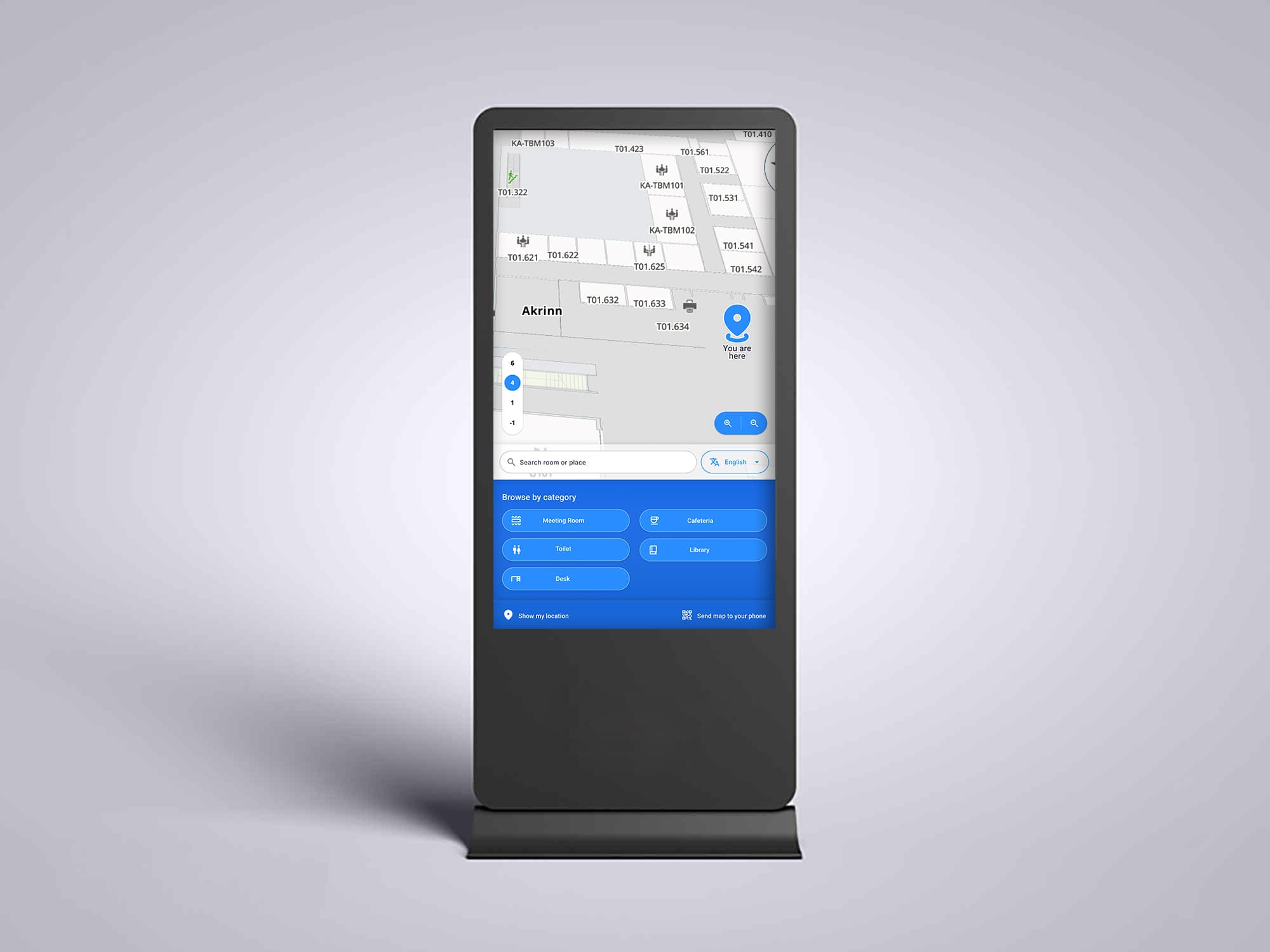
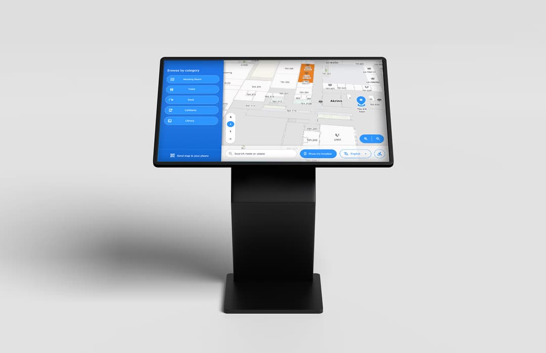
A clean, map-first interface designed for fast, public use. Large touch targets, clear hierarchy, and minimal copy reduce hesitation and cognitive load.
The UI adapts to landscape and portrait kiosks, supports multilingual use, accessibility needs, and scalable category-based navigation with filters and QR handoff to mobile.
Learnings
- Designing for kiosks is not the same as designing for web or mobile. Large hit areas, faster recognition, and clear interaction zones matter more.
- Clarity can improve without changing the whole flow. Small visual and structural adjustments often solve disproportionate friction.
- Flexibility matters in white-label public products. The base system must remain clear even when institution-specific layers are added.
Next steps
- Conduct usability testing with real users in university and hospital environments.
- Validate the UI across different kiosk sizes and orientations (portrait & landscape).
- Fine-tune theming and configuration options to support multiple institutional brands.
Business Impact
The redesign direction showed how a legacy public-facing kiosk could be improved without a costly rebuild. It created a clearer path toward a more modern, accessible, and scalable product, while supporting branded deployments across different institutions.
By introducing clearer UI patterns and a more flexible system foundation, the concept improved implementation readiness and long-term product consistency.